Tag Archives: J M Barrie

Gloucester Road – gateway to London

Last week at Notting Hill Gate I looked at one of the deepest layers of my personal archaeology of London. This time I’m going to begin at an even deeper level.When I first came to London in 1973 I lived in Camden. But most Sundays I would get the tube from Camden Town to Gloucester Road, walk south to Old Brompton Road, turn left into Roland Gardens which took me to Evelyn Gardens where Imperial College had some halls of residence. My friend Carl lived there. Some Sundays we would just hang out, sometimes we would go and have a meal at a cafe in the Earls Court Road and sometimes we would begin to explore London.

I wasn’t the first person to start out with London from Gloucester Road. It’s still a place full of hotels,  tourists and coaches, people with trolleys puzzling over the tube map and the rules for using Oyster cards, tour buses getting in the way of the 49. And plenty of people not quite sure why they are starting out their journeys from this particular ordinary street.

Back in 1969 when you left the station, this is what you saw on the other side of the road:

Gloucester Road - east side KS 357075-73

Individual retailers mostly, still operating in a time-honoured fashion (note the delivery bike.)

Gloucester Road - east side, 83-81 KS 3571

The shops are under a 19th century terrace.

Gloucester Road - east side, 85 KS 3573

The Empire Grill, now home of Burger King, and a couple of old friends:

Gloucester Road - east side, 95-93 KS 3574

The Wimpy Bar, home of the UK’s own brand of hamburger, (waitress service and individually cooked burgers), now part of a branch of Tesco, and the Midland Bank, later part of HSBC.

If you were to turn around you could see another familiar building, Bailey’s Hotel.

Gloucester Road 140 Baileys Hotel KE75-36

But this week we won’t confine ourselves to living memory. Turn the dial back further:


Gloucester Road Baileys Hotel PC456

The old version of the building – it was owned by James Bailey and was at the time one of the best hotels in London, with many “American” features including an “ascending room” (lift). In 1890 it had over 300 apartments. Some of the spectacular internal features survive today.

The structure on the island opposite the station is an air vent for the railway

Further south down the road you come to this pleasant looking house opposite Hereford Square. I must have walked past it hundreds of times before I found that J M Barrie lived there. It has no blue plaque. That was taken by his house in Bayswater. But this was the house where he wrote some of his early successes, Quality Street and the Admirable Crichton.


Gloucester Road 133 J M Barrie

This stretch of Gloucester Road has houses and flats in the same scale, low-level, almost suburban. The mix of styles is probably to do with postwar development. There was some bomb damage in the area so the buildings have a charming individual quality. We’re coming to the end of the road at this point and I’m not going to take you along the rest of my 1970s route. We’re going back to the intersection with Cromwell Road. You won’t find this building there today. This is how the corner with Cromwell Road appeared in the 1930s.

Gloucester Road 118 1920s30s K4611B - Copy

Later, in 1969 you can see that entrance on the right of this picture:


Gloucester Road looking south from Cromwell Road dec 1969 - Copy

The grand entrance remained but there was no longer a bank on the site.

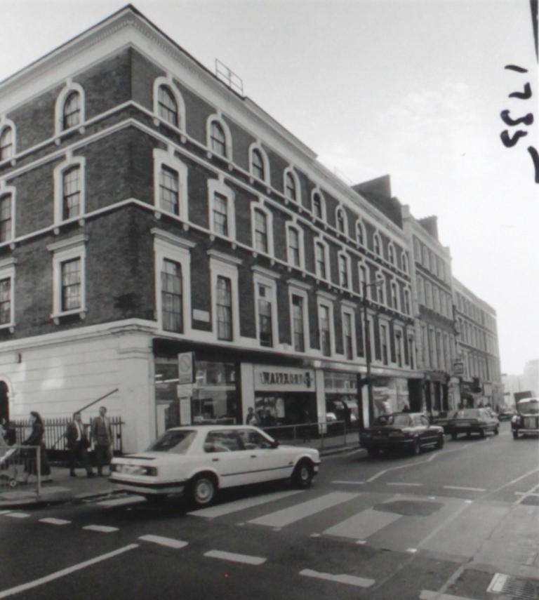
North from Cromwell Road, the buildings on either side of the road grow taller, even in the earlier days of the street.

Gloucester Road PC505 fp - Copy

This picture obviously comes from a quieter period for traffic. That street sweeper would not be standing there in later years. If you look in the distance as the road curves can you see this building?

Gloucester Court

St George’s Court, an apartment block built in 1907-09.  Here it is in another postcard:

St George's Court Gloucester Road

The ornate apartment block with its shops surmounted by small roof gardens is still there today of course.  Having already looked at the Survey of London for information on Bailey’s Hotel I naturally turned to them for some details on St George’s Court and they have done us proud again:  “This hefty building..is in one of the dowdier styles of Edwardian architecture, mixing elements  of Tudor and Baroque. red brick and brown stone dressings”.  Words I could not argue with, although I still like to look at it while passing by on the upper deck of a 49.

Arguably a more interesting block than on the opposite side of the road where there have been a few changes.

00014 - Copy (2)

A branch of Waitrose, 1970s, but I’m not sure of the exact date.

00013 - Copy (2)

And a couple of flash cars. These two pictures are from a contact sheet. It almost looks as though the photographer was on the move at the time.

As we come to another curve in the road and the end of Gloucester Road, this postcard image of a recognizable corner predates St George’s Court.

PC108 - Copy

This slightly blurred image is further north but shows the end of the road with a man running towards it for some reason best known to himself.

Pc511 - Copy

Finally, as we’ve bobbed about through the years this week, let’s go back to one of my favourite artists, William Cowen for a Gloucester Road view before the age of photography when a narrow road which was still called Gloucester Road ran through a rural setting.


C23 Mr Rigby's cottage

Mr Rigby’s cottage, near the station.

Postscript

It’s week eight of the great scanning famine (possibly the last week, fingers crossed) but I’m still finding pictures. I could almost have done a whole post just on postcards, but I decided to give you a touch of everything. There may be a iteration of the secret life of postcards coming up soon. I’ve just acquired an illustrated book by High Thomson, so if I can only scan the pictures, you can expect another post about him. It’s nearly time for some holiday posts.

In another postscript I referred to the fact that my friend Carl died quite young in 1999 but that I didn’t find out until quite recently. Writing this made me think of him again, our early days in London and the things he missed by never seeing this century. So I hope you’ll forgive me for dedicating a post once again to my friend Carl Spencer.


Thomson’s miscellany

Since I first encountered the art of Hugh Thomson in the 1903 edition of Frances  Burney’s Evelina I’ve been looking for more of his artwork both online and in the books in our basement stores. Just as with Yoshio Markino there is a treasure trove of material waiting to be discovered when you first encounter a book illustrator.

In Thomson’s case the fascination lies both in the images themselves and the way they recall half-remembered illustrations from children’s books. As a child I moved from Muffin the Mule to Winnie the Pooh to books on Greek and Roman myths to Marvel comics. Thomson’s illustrations seem to me to be half way between classic book illustrators like Rackham and Greenaway and the great artists in the comics, both British and American.

I found several books illustrated wholly or partly by him: the two J M Barrie plays I’ve written about (here and here), the Highways and Byways of London (part of a travel series – he was involved with several others), poetry by his friend Austin Dobson: Rosina, and others, the Mrs Gaskell novel Cranfield and the illustrations he did for the Jane Austen novels.  (I  bought a reprint of his heavily illustrated edition of Pride and Prejudice, well worth checking out) And finally (for now) there was of course the 1931 biography of Thomson by M H Spielmann and Walter Jerrold.

Thomson was born in 1860 in Coleraine in Ireland but spent a large portion of his life in and around London. He died in Wandsworth in 1920. For most of his career he was a prolific and successful artist. The rest of this post is a selection of some of the work I have come across.

One of his late commissions, published posthumously was a set of coloured pictures for Nathaniel Hawthorne’s the Scarlett Letter, a historical novel about a woman condemned to wear the letter A on her clothes for conceiving a child out of wedlock.

Hester Prynne fron the Scarlett Letter

Hester Prynne while “standing on the pillory scaffold recalls ‘her own face, glowing with girlish beauty, and illuminating all the interior of the dusky mirror in which she had been wont to gaze at it'”. Below she wears the A for adultery:

hester prynne in the scarlett letter

In 1912 he worked on Oliver Goldsmith’s 1773 comedy She stoops to conquer. We’ve already seen Thomson had a particular liking for 18th century settings .

she stoops 006

The play is a tangled story of impersonations, misunderstandings and intrigue over marriage and inheritance. As in Evelina, Thomson captures how we imagine the life and manners of a pre-photographic period. (Thomson studied the history of costume to ensure accuracy).

Below, Kate adopts the dress of a housekeepert.

018-a3s1-tell-me-pimple-how-do-you-like-ny-present-dress

Which all ends in tears, by the looks of it.

she stoops 003 - Copy

But never mind. There’s flirting:

She stoops to

And dancing of course, before the play has run its course.

Keep up the spirit of the place.

“She stoops” was Thomson’s “big book” for the autumn. The next year he did Quality Street after a lunch with J M Barrie who described the pictures as “quite delightful” and Thomson, after his death as “a man who drew affection at first sight.”

Still in the 18th century, Thomson’s pictures for Austin Dobson’s the Ballad of Beau Brocade (1892) – one of several books by Dobson which he illustrated.

The old sedan chair from the Ballad of BB

Some comedy business with a sedan chair,

Ballad of beau brocade 02

and a then a carriage,

Ballad of Beau Brocade 02 (2)

After which the young lady needed a bit of lazing around, nodding off in the window seat. William Pitcher singled this picture out for praise noting “with what exquisite lightness and conviction has HT touched in the effect of the short muslin blinds blowing out of (the) window”.

Thomson also worked on Dobson’s collection the Story of Rosina and other verses (1895)

Rosina 005

“Harp-prest bosoms” – a fascinating image. This period  was one where Thomson was frequently sought after by publishers. One asked him to do Washington Irving’s Old Christmas but he thought he couldn’t better Randolph Caldecott’s version.

Rosina 010

Nuns on the trail of a magpie. Why not? (Black and white – did you see what he did there?)

A late piece of work, from 1915, not published at the time:

Caleb Plummer and his blind daughter from the Cricket on the hearth

Caleb Plummer and his blind daughter Bertha from Dickens’s Christmas novella The Cricket on the Hearth (1845)

After Dickens, then Shakespeare. Thomson shows the Merry Wives of Windsor in mischievous good form. (1910).

merry wives 03

Tricking Falstaff into the laundry…

merry wives

and into the water.

merry wives 05

That’s all for now. We’ll see Hugh Thomson again. There are still the London pictures and the Austen books, and all the scenes of rural life. But we’ll leave him for the moment.

It was a great period for book illustrators and there are amazing things to be found in the stores of public libraries and online.

Postscript

As I’m writing it’s another bank holiday, just as when I wrote about Thomson and Fanny Burney’s Evelina. This time a wet one, but still conducive to reading and writing and posting lots of pictures. One more:

Rosalind andCelia Copy

This wasn’t going to be this week’s post – it was going to be next week’s, but I haven’t quite finished the one which will now be next week’s. I was writing two posts over the weekend and got engrossed in the biography.


Thomson and Barrie: The admirable Crichton

The recent post about Hugh Thomson’s illustrations to J M Barrie’s play Quality Street attracted quite a bit of attention in an otherwise quiet month so I was happy to take up an offer to do the same with Barrie’s other play of 1901/02, The Admirable Crichton. This was one I had heard of, thanks to the 1957 film version starring Kenneth More, seen many years ago on one of those Sunday afternoons of childhood when you’d watch anything that was on. The final scene has remained in my memory, but no spoilers yet.

1901 had been a good year for Barrie. Quality Street opened in New York and he finished Crichton while he was attending rehearsals for Quality Street. Within a short space of time he had two plays on the London stage. He and his wife were in the process of moving out of their Gloucester Road house to another house in Leinster Gardens, Bayswater which was close to Kensington Gardens, a favourite haunt of both of them.

Crichton is an odd sort of story. It was described as “a fantasy in four acts” but it is also a satire or maybr even some kind of parable about the rigidly stratified structure of Edwardian society. It begins with a portrait of an aristocratic household with the mildly eccentric Lord Loam, his three daughters and Crichton the butler a man who knows his place and wishes everyone else would stay in theirs.

001 p38 Lord Loam - My friends I am glad to see you all looking so happy

Here Lord Loam addresses his family, some friends and his staff at one of his regular teas at which the family serve the staff. Everyone  is uncomfortable with this arrangement but him.

Lady Mary’s fiance Lord Brocklehurst has an uncomfortable conversation with Tweeny the “in between” maid.

002 Brocklehurs and Tweeny - what sort of weather have you been having in the kitchen

Lord Loam has also annoinced that on the forthcoming sea voyage his three daughters will have to share one lady’s maid between them. The whole thing leaves the Ladies Mary, Catherine and Agatha shocked and dismayed.

003 I have decided --- one maid between them

And then really quite tired.

008 The ladies are at rest until it is time to dress

This portrait of  the indolent trio in a state of profound relaxation is one of Thomson’s best. It’s curious to see him portraying contemporary dress.

The next time the three are pictured together is after the party is shipwrecked on an island. They still look pretty relaxed.

009 They have a sufficiency of garments

Of course the hapless aristos are not really equipped for life in the wild.

013 Lord Loam - Not one monkey had sufficient intelligence to grasp my meaning

Lord Loam cannot get the monkeys to understand him. Just as the story has now moved into the realm of fantasy Thomson’s illustrations shift into another mode to show a partly realistic, partly magical setting.

Crichton and Tweeny of course turn their hands to the business of staying alive on the island.

010 Tweeny- Look what I found

Their practical skills and the ability to cook food changes the group dynamic and puts Crichton in a leading role.

014 One by one they steal nearer to the pot

After a couple of years on the island Crichton is in charge and goes by the title the Guv.

Tweeny now runs the household.

016 Tweeny had dressed wisely for an island

While the three sisters have become able hunters.

017 We've some ripping fish for the Gov's dinner

This is all very reminiscent of Never Never Land.

020 We were chasing goats on the big slopes and you out-distanced us all

Lady Mary now callede Polly hunts down a goat.

Crichton asks her to marry him to general consternation.

????????????????????????????????????

At almost the exact moment they hear the sound of a ship. Lady Mary wants Crichton to ignore it so they can all stay in the wild world. But Critchton does his duty as he sees it and sets off a signal to the rescuers. They return to their old social positions back in London for the final act.

026 Well were you all equal on the island

They all deny the truth despite an interrogation from Lord Brocklehurst’s mother. Barrie playe around with the ending. At one tiem it was suggested that Crichton and Tweeny went off together to run a pub in the Harrow Road. In the first version I looked at, the limited edition, he simply announces his intention to depart and turns out the light.

The first actress to play the role of Lady Mary was  Irene Vanbrugh who has featured on the blog before in this post about Trelawny of the Wells.

Irene-vanbrugh-Admirable-crichton-1902-mary

She looks a little like Peter Pan in this photograph and even more so in this picture, which was much reproduced at the time:

Van1

The first Peter Pan was actually Nina Boucicault the daughter of the impressarion Dion Boucicault (we’ve  met him before at his house in the Old Brompton Road).

From a modern standpoint the play looks like a quaint comedy of manners, but writing in 1922 H M Walbrook called it “one of the most penetrating dramatic social pamphlets of the day.” For me it’s an interesting foray into a fantasy world which never seemed too far away with Barrie. And I wonder what influence Thomson’s illustrations had on later works.

Postscript

Thanks once again to Peter Collins of Westminster Central Reference Library for suggesting the Admirable Crichton and loaning it to me. And thanks to Kim for transporting it.


Thomson and Barrie: Quality Street

Hugh Thomson, whose illustrations to the 1903 edition of Frances Burney’s Evelina formed the basis of a recent post, was a prolific and popular illustrator. He produced drawings for some editions of Shakespeare, did illustrations for all of Jane Austen’s novels and also drew pictures to accompany editions of poetry and plays.

I was at pains last time to demonstrate Burney’s local connection in order to justify a post about Thomson’s work. So again I have to point out the local connection of his collaborator, Kensington resident J M Barrie, who had a couple of addresses in Kensington including 133 Gloucester Road, a house I walk past every day, up till now not realising who had lived there.

Before the success of Barrie’s Peter Pan play he enjoyed another stage sensation in London and New York with a play called Quality Street. And yes, they did name the famous tins of chocolates after the play. More of that later, but first, a sort of apology. I was a bit unkind to Barrie’s creation Peter Pan in this post last year. The problem was that Arthur Rackham’s illustrations for Peter Pan in Kensington Gardens are very much better than the text itself.

The apology to Barrie is due because unfortunately the same is true of Quality Street. Hugh Thomson’s illustrations are much more enjoyable than the actual story.

004

So briefly then. Phoebe, a young woman of 20 falls in love with Brown, a young doctor. Just as she is expecting a proposal Brown goes off to war. (These are the Napoleonic wars). Ten years go by. Phoebe and her sister Susan are running a small school for turbulent children (their straitened circumstances are due to some bad investment advice from Brown which never got mentioned to him). Phoebe considers herself to be an old maid at the age of 30. Brown, having distinguished himself in the wars returns, missing an arm, but still not showing any sign of asking Phoebe to marry him. Just a little annoyed by events Phoebe re-invents herself as her own niece Livvy, flighty and flirtatious where “Miss Phoebe” is staid and dowdy.

act 2 007

[The veiled Phoebe and her sister Susan are taken off to a ball by Valentine Brown]

Girls just want to have fun basically, which is what ensues, along with some hilarity. The deception somehow works and causes some complications for Phoebe. Eventually Phoebe and Brown realise they love each other, the whole thing is sorted out and the fictional Livvy is smuggled out of the narrative to everyone’s satisfaction.

During the course of collecting the images for this post I read most of Quality Street and while I still hold to the view that the pictures are the most interesting thing about it, I did warm to some of the dialogue after a while (although the story is  still quite silly and Barrie’s stage directions sound like he’s writing a DVD commentary). If I had been around in London at the time I might have gone to see it, as many others did. It was a good boost to Barrie’s career.

But as with Evelina, Thomson’s pictures are why we are here. They tell the story, (or any other story you could fit with them) in a manner I find perfectly satisfactory in itself.

Austen-esque young women while away their time in elegant sitting rooms, reading to each other, playing cards:

017

Listening at doors (a fine comic image):

007

Falling in love (a nice rainy picture with a little hint of Markino about it):

010

There’s a bit of comedy discipline in the school room.

013

But discipline breaks down and the tables are temporarily turned:

act 2 004

There’s a series of balls of course:

018

With the regulation row of expectant young women:

019

Some flirtation, from the Miss Livvy alter ego, with a pair of dim young men.

021

Thomson is mostly known for monochrome illustrations but his coloured illustrations to the play show he was just as good with colour.

There’s a certain amount of watching from windows:

act 4 002a

Gossip in the street:

020

A bit of drawing room intrigue:

023

Some game playing as the penny starts to drop:

022

And eventually a reconciliation as the supposedly ailing Miss Livvy turns back into Phoebe.

024

Sorry, some spoilers there. But I imagine the pleasure of actually seeing the play would lie in the repetition of familiar tropes rather than novelty. As with Evelina, Thomson seemed to have liked the journey but been less concerned with the denouement.

Quality Street was filmed more than once. A 1927 version featured Marion Davies,the mistress of William Randolph Hearst. There was also a 1937 version featuring the young Katharine Hepburn as Phoebe.

Katherine Hepburn in Quality Street

This still is quite a close match to one of Thomson’s illustrations.

img021

The play contiuned to be revived. Our local theatre the Finborough Theatre in Finborough Road did a version in 2010.

qualitystreet6
But all that passed me by and until very recently the name only meant tins of chocolates.

Quality Street was an innovative product first sold in 1936. The company invented a device to wrap the sweets in coloured paper and conceived the idea of putting them into a tin . This made the product cheaper than boxes of chocolates with individally wrapped sweets. Harold Mackintosh combined aspiration with nostalgia by naming his product after the play. Some readers may remember that the tins used to feature a pair of characters know in the trade as Miss Sweetly and Major Quality who were always depicted in a vaguely Regency / mid-Victorian setting probably suggested by Thomson’s pictures. As I recall there were TV commercials featuring the two as well, especially at Christmas where they merged with the general 19th century Dickensian season of bonnets and crinolines. .

QS tin

You can see that Miss Sweetly has moved forward a couple of decades in terms of fashion but Major Quality’s uniform still resembles that of a traditional red-coated British officer. It wouldn’t be going too far to suggest that Thomson played a part in the creation  of our Christmas iconography.

Postscript

Although I’d never heard of Thomson when I first came across that edition of Evelina, once I started looking I found plenty of examples of his work and I’ll probably return to him again in the future. Like Randolph Caldecott  (another book illustrator who made a contribution to the idea of Christmas) he was one of those artists who could perfectly complement an author’s work and at the same time create his own imaginative landscape. He has led me to other book illustrators whose work we can look at in the next few months.

I have to thank Peter Collins of Westminster Central Reference Library for graciously allowing me to examine the original limited edition of Quality Street signed by Hugh Thomson and to scan the coloured pictures. The black and white images come from a much more lowly 1938 edition. Thanks also to Susie Hilmi for transporting the book and brokering the deal.